3. Finding your way around#
Etappe has two levels. On the outside are the collections that apply to all trips: your trips, the travelers, open alerts. On the inside is the single trip with its sixteen sections — from the sketch to the journal. Once you have understood this split, everything else falls into place.
3.1 Layout on the iPhone: the four tabs Trips, Travelers, Alerts, More#
| Tab | What you find there |
|---|---|
| Trips | The overview of all trips. The starting point for almost everything. |
| Travelers | People and pets as photo tiles. |
| Alerts | Everything that needs attention — with a number on the icon. |
| More | Overview, Records, and all settings. |
A number sticks to the Alerts tab as soon as something is open: expired documents, overdue reminders, deadlines for pets and vehicles. When nothing is open, it disappears (Alerts).
Under More you find: Overview, Records (Countries, Vehicles, Packing list templates), Reminders, Settings, Storage & files, Backup, Help, About this app. At the very top is the note about the full version (Trial and full version).
3.2 Layout on the iPad: sidebar, detail column, landscape and portrait#
On the iPad, a sidebar replaces the tab bar. It lists everything one below the other: Overview, Trips, Alerts, Reminders, Travelers, Countries, Vehicles, Packing list templates, Settings, Storage & files, Backup, Help, About this app. To its right is the detail column.
When you open a trip, the iPad behaves differently depending on its orientation:
- Landscape: The sidebar becomes the trip’s command center. At the top are “Trips” and “Overview”; below them, under the trip title, the trip’s own “Overview” and all sixteen sections; the selected entry is highlighted.
- Portrait: The trip appears as a full trip page, just as on the iPhone, with a “Trips” back button at the top left.
A large iPhone in landscape deliberately keeps the tab bar — otherwise the navigation would jump back when you rotate the device.
3.3 The trip page: hero, tiles, section navigation#
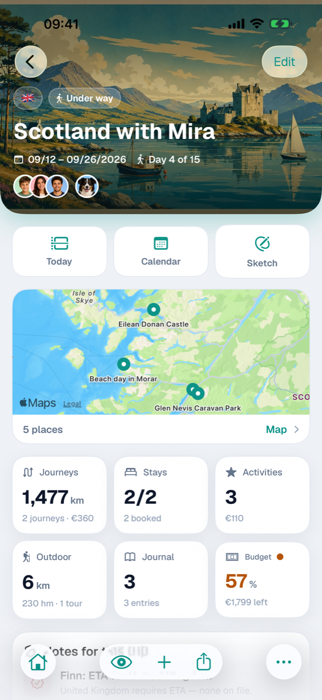
The trip page starts with the hero: cover photo or color gradient, on top of it the flags of the trip’s countries, the status pill, title, period and — during the trip — “Day 3 of 12”. If the trip is still ahead of you, it says “in 47 days”. The flags lead to the country overview, the avatars to the travelers. At the top right, Edit opens title, period, travel party, countries, cover, and budget.
Below that are three shortcut tiles — Today, Calendar, Sketch — followed by the overview:
- A small map with the accommodations and activities that have a location (and, if set, your home location); the footer (“4 places”) leads to the large Map, which also shows journeys, outdoor activities, and journal places. Without an accommodation or activity that has a location, the small map does not appear at all.
- Six stat tiles: Journeys, Accommodation, Activities, Outdoor activities, Journal, Budget. Each leads to its section. On the Accommodation tile, the number (“2/3”) turns yellow as long as not all accommodations are booked; the Budget tile carries a status-light dot.
- Notes for this trip — the alerts for exactly this trip, with a way to the Entry checklist. When nothing is open, a green confirmation appears there; if no travelers have been assigned to the trip yet, a neutral note instead says that there is nothing to check yet.
- Next steps with the three most important open to-dos and the packing list progress.
- For completed trips, additionally your Verdict, if you have written one.
3.4 The bottom toolbar: house, eye (sections), plus (Add new), Share, More#
Inside a trip, the tab bar gives way to a toolbar of its own:
| Icon | Name | Effect |
|---|---|---|
| House | To trip overview | Back to the list of all trips. |
| Eye | View sections | Grid with all sections of the trip. |
| Plus | Add new | Grid with everything that can be created here. |
| Arrow | Share | Menu with the output formats. |
| Three dots | More | Edit trip, settings. |
The eye shows the thirteen sections that are not already shortcut tiles at the top: Accommodations, Journeys, Activities, Outdoor activities, Budget, Journal, Packing list, To-dos, Checklist, Research, Reminders, Documents, Map. Most tiles carry their count, for the packing list as “7/23”, for the to-dos the number of open ones. Empty sections show no number, and Checklist and Map never carry a count at all.
The plus creates directly: journey, accommodation, activity, outdoor activity, journal entry, budget item, to-do, research item, reminder — without going through the section.
Behind Share are Events as calendar (.ics), Sketch as PDF, Itinerary as PDF, and Journal as PDF. Sketch and Journal are grayed out as long as there is nothing to print; “Photo book” is marked as an upcoming feature (Exports and printouts).
3.5 Working with lists: search, filter, sort, swipe, press and hold#
The trips overview has filter chips at the top: All, Under way, Making arrangements, Planning, Bucket list, Considering, Past, Archive. “All” shows trips that are under way and the next upcoming one as large cards, everything else as compact squares.
Lists inside a trip sort themselves — by date, then by name. Entries without a date gather under “No date yet”. There is deliberately no sort option. Filtering is available where it helps, for example in the packing list by person via the filter icon. A search exists only in the country selection.
Three gestures repeat everywhere:
- Swipe left deletes a list entry.
- Swipe right opens the edit form — in the packing list, to-dos, budget, reminders, and sketch.
- Press and hold opens the context menu: on a trip card “Archive” and “Delete trip”, on a person tile additionally the validity status of their documents.
Deletions that affect more than one row ask first and tell you what goes with them.
3.6 Forms: required fields, Cancel, Save#
Forms open as a sheet over the view: Cancel at the top left, Save at the top right, and the fields in sections in between. Cancel discards all changes made in the form.
Required fields are rare — usually a name or title is enough. If it is missing, “Save” stays grayed out. Everything else you may leave open and add later.
Periods and additional fields sit behind switches (“Set period”, “Set departure/arrival”) so that a form does not get longer than your plans. Selection lists for people, pets, or countries open as a page of their own with checkmarks and are closed with Done.
3.7 Light and dark, text size, accessibility#
Under More → Settings → Display you choose the Appearance: System, Light, or Dark. “System” follows the device, including the automatic switch in the evening. Both modes are designed as equals, not just recolored.
The text size comes from the iOS settings (Display & Brightness → Text Size). Body text, lists, and forms grow with it; a few very compact labels on tiles and pills keep their size so that the numbers remain readable side by side.
Every button has a name, even when only an icon is visible — VoiceOver reads out “Add new” or “To trip overview”. Instead of emojis, the app uses system symbols throughout; the only exception is the country flags, because they are a data field.
Also under Display is Names in checklists: first name only, or first and last name. All other switches are explained in All settings.